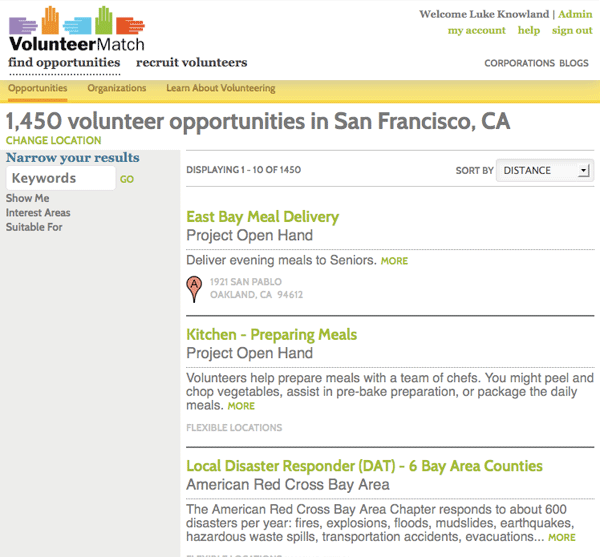
As the viewport begins to narrow, the page layout adjusts. Here we have the page as it lays out for a tablet. There is still full header navigation and links, but now the results layout into two columns.
![[lgk productions]](/images/1x1.gif)