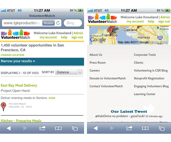
And here we have how it appears on a mobile device. Note that the functionality at this point is narrowed to search, and being able to log in to one's account. The header now becomes fixed to maintain visual branding.
Additionally, note that, given the small amount of real estate, the footer has been streamlined to the basic parts of the site, not all of the links that were available when viewed on a larger viewport.
All three of these views of the page are the same HTML, simply changing what style to apply to the various elements based on the width of the device. The largest challenge associated with this was determining what content to move/minimize/hide as the viewport became smaller.
To see the acutal interactive demo, click here, and adjust the width of your browser (providing you're using a browser that supports HTML5 and Media Queries).
