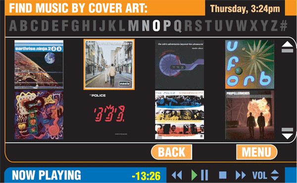
The Zilonis (Latvian for "elephant", an animal that never forgets), was a 6x3.7 inch touchscreen (16:9 ratio) audio device, aimed at the yacht/Las Vegas limo fleets/high-end home audio center audience. The prototype was developed over a 3 1/2 month timespan in 2005.
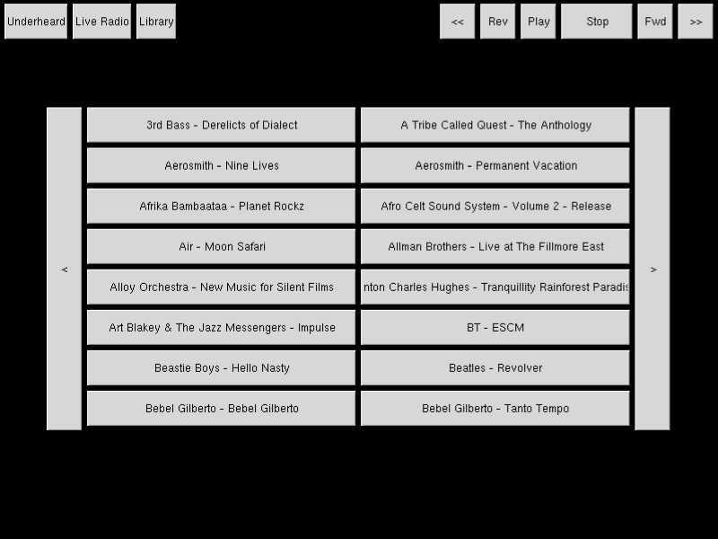
I was approached in early April 2005 to develop the user interface. At the time, the exising interface consisted of basic gtk buttons for play/stop/previous/next, and a 16-up listing of available ablums (also gtk buttons), which a user would interact with with a stylus (see bottom image to the right).
I started development work started in mid-May 2005.
And version 1 of the prototype was done in September 2005.
At the time, Most (if not all) MP3 players were either entirely without a user interface (Creative Player), or were the old school click wheel iPods.
Zilonis - September of 2005Determining how to interact with and manage a music library entirely via a touchscreen.
Find music by album art - no players had that at the time.
Alphabet slider - out of a dislike/not being impressed with the iPod click wheel dial thing, as it always struck me as unintuitive, I came up with the idea of a slider that would navigate through the library of music alphabetically. This type of interface didn't exist in any devices at the time.
Consistency in interface elements (but addressing when to alter said consistency)
Research to figure out where user thinks they touch vs. where they touch
Aspect ration difference (6x4, but not 800x600 - 800x495....) - height x 1.21.4 So all graphical assests needed to be created such that upon compression they would "look right", developed image conversion for aspect ratio
For more screens, click here.

